
When someone lands on your website, you have a matter of seconds to answer a few critical questions:
- Am I in the right place?
- What does this business do?
- Can they help me?
- Why should I trust them?
If those questions aren’t answered quickly, many visitors will leave before they ever scroll down the page.
That’s why the area known as “above the fold” remains one of the most important sections of any website.
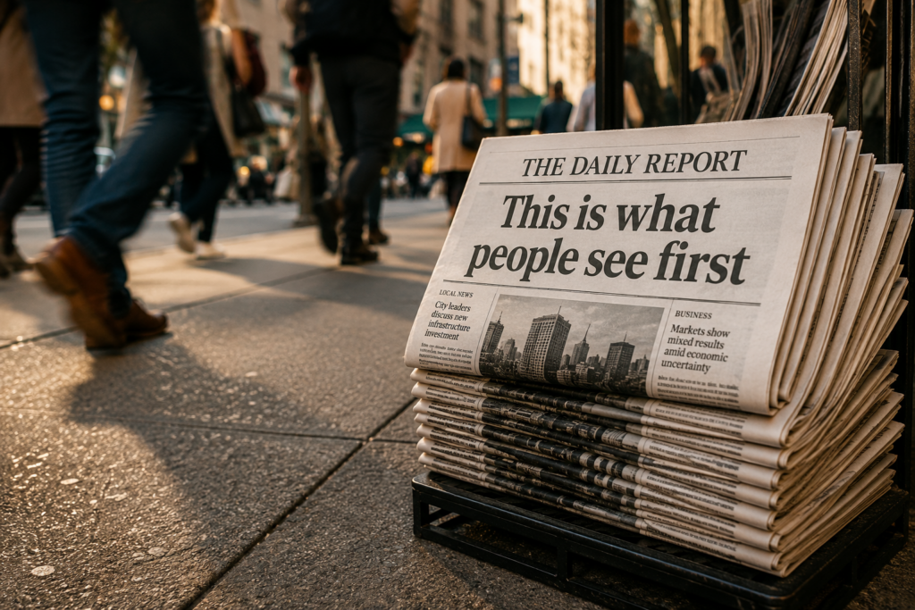
What Does “Above the Fold” Mean?
The term “above the fold” originated in the newspaper industry.
When newspapers were displayed in boxes or on store shelves, only the top half of the front page was visible. Publishers reserved that space for their most important stories and headlines because it determined whether someone would pick up the paper and read more.
The same concept applies to websites.
Above the fold refers to the portion of a webpage visible before a visitor scrolls.
It is your digital first impression.
Does Above-the-Fold Content Still Matter?
Some web design trends come and go.
Above-the-fold content isn’t one of them.
People scroll constantly today. That’s not the issue.
The issue is whether they choose to continue scrolling.
Before visitors invest more time in your website, they want confidence that they’re in the right place.
Strong above-the-fold content helps create that confidence.
When it is unclear, confusing, or cluttered, visitors often leave before exploring further.
The Goal of Above-the-Fold Content
Many businesses approach this section incorrectly.
They focus on what they want to say.
Visitors are focused on what they need to know.
The primary purpose of above-the-fold content is to create clarity.
Visitors should immediately understand:
- Who you are
- What you do
- Who you help
- Why you’re different
- What action they should take next
Everything else is secondary.
Start With a Clear Value Proposition
One of the biggest mistakes businesses make is using vague marketing language.
Phrases like:
- Solutions for Success
- Excellence Through Innovation
- Your Trusted Partner
may sound impressive internally, but they don’t actually explain anything.
Instead, your headline should clearly communicate what your business does and who it serves.
A visitor should not have to guess.
The clearer your message, the easier it becomes for people to understand your value.
Make Your Branding Visible
Your branding should be immediately recognizable.
This typically includes:
- Logo
- Brand colors
- Visual identity
- Consistent messaging
Branding helps establish familiarity and trust.
However, branding alone is not enough.
Visitors still need to understand what the business actually does.
Use Images That Support the Story
Images often create an emotional response before a visitor reads a single word.
The strongest website imagery reinforces the message rather than distracting from it.
Ask yourself:
- Does this image represent our audience?
- Does it reinforce our expertise?
- Does it help explain what we do?
Stock photos that exist purely for decoration rarely add value.
Purposeful visuals do.
Give Visitors a Next Step
Once visitors understand who you are and what you offer, what should they do next?
Every page should provide a clear path forward.
Examples include:
- Schedule a consultation
- Request a quote
- Contact your team
- Download a guide
- Learn more about a service
Without a clear call to action, visitors often leave without taking the next step.
Navigation Should Be Simple
Website navigation exists to reduce friction.
Visitors shouldn’t have to hunt for important information.
The best navigation systems are often the simplest.
Focus on helping people quickly find:
- Services
- About information
- Contact details
- Resources
- Frequently asked questions
When navigation becomes complicated, user experience suffers.
Above the Fold and Search Visibility
Many business owners think of above-the-fold content purely as a design consideration.
It’s actually much more than that.
Search engines, AI-powered search tools, and website visitors are all trying to answer the same question:
What is this business about?
The clearer your messaging and page structure, the easier it becomes for both people and technology to understand your website.
Clarity supports visibility.
Confusion creates friction.
What Most Businesses Get Wrong
The most common problem we see isn’t bad design.
It’s unclear communication.
Many websites spend their most valuable screen space talking about themselves instead of helping visitors understand the problem they solve.
Visitors care less about your history and more about whether you can help them achieve their goals.
The businesses that perform best online are often the ones that make their value immediately obvious.
Your First Impression Should Work as Hard as the Rest of Your Marketing
A website visitor may spend only a few seconds evaluating your homepage before deciding whether to continue.
That’s why above-the-fold content deserves careful attention.
The right combination of messaging, branding, visuals, and structure can help visitors feel confident they’ve found the right solution.
And when people stay longer, explore more pages, and engage with your content, your website becomes far more effective at supporting visibility, trust, and growth.
At Houndstooth Media Group, we help businesses create websites that are easier to understand, easier to navigate, and easier to trust because clarity is often the difference between a visitor who leaves and a visitor who becomes a customer.