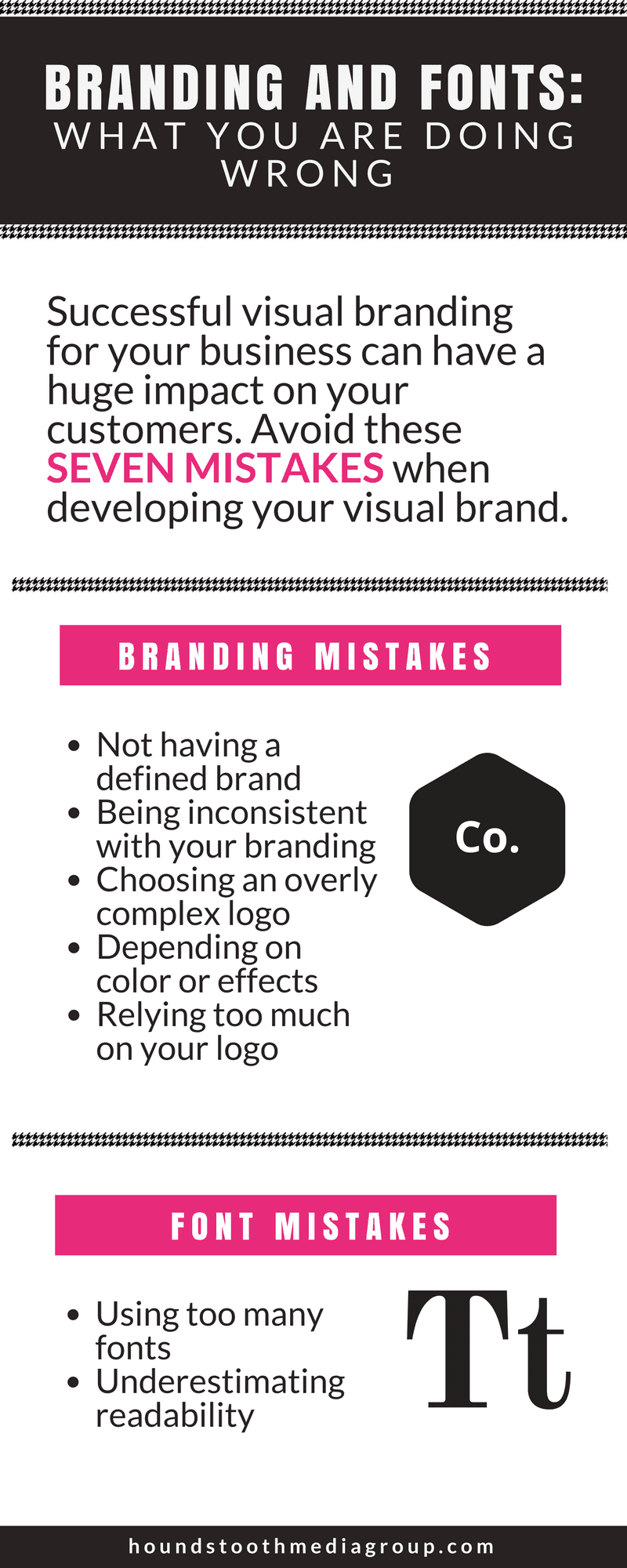
Successful visual branding for your business can have a huge impact on how it is perceived by your customers. Your goal is to make a strong first impression and then to reinforce that good impression over and over again. It is crucial that you choose the right branding for your business from the get-go, so you have that consistent presence in your customers’ minds. Here are seven mistakes to avoid when choosing branding and fonts for your business.

Branding Mistakes
Not Having a Defined Brand
Before you can start creating a visual brand for your company, you need to take stock of what message you want to send to the world with your branding. What are the key messages you want to communicate about your brand? What does your company do? How are you different than your competitors? Any graphic elements should reinforce this messaging.
Being Inconsistent

A template helps to keep our branding consistent in every blog post.
After having a clear brand focus, the most important part of visual branding is consistency. Your branding should span your across your entire online presence and also be present print materials. You can even carry your branding over to the way you decorate your office or choose your wardrobe! To keep your branding consistent, it is important to create brand standards and design templates that you can use for all your marketing materials.
Choosing an Overly Complex Logo
It is exciting to see the characteristics of your brand materialize in the form of a logo, but be careful not to overload your logo with too many design elements. The most successful logos are clear and memorable. Your customers should be able to identify your logo at a glance. You will also want to choose a logo design that is adaptable to a variety of formats, from letterhead to your Twitter header to t-shirts.
Depending on Color or Effects

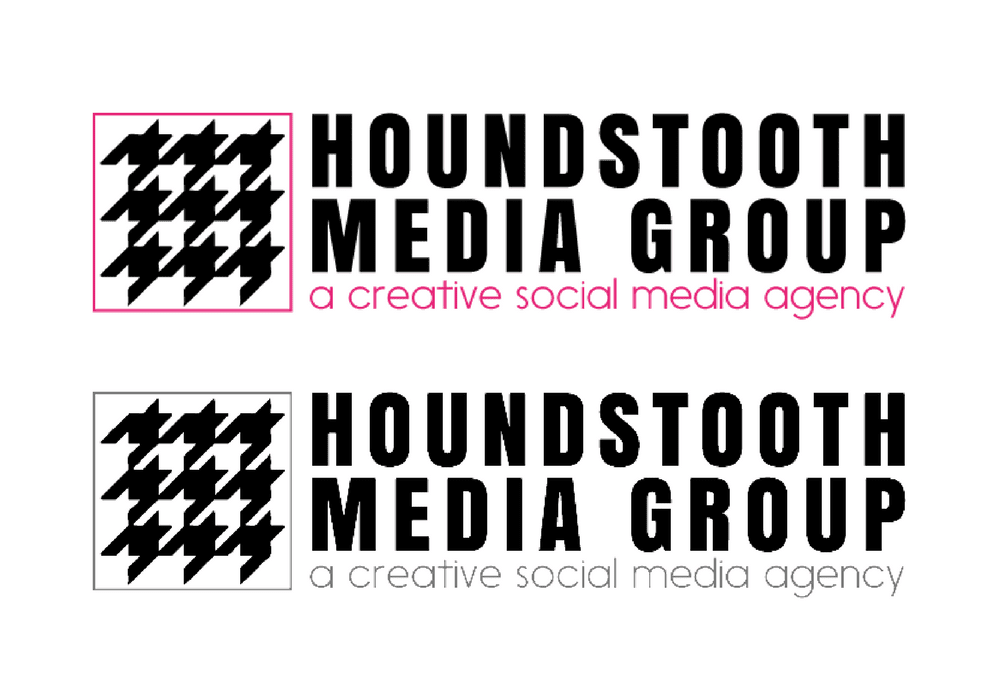
Our logo works well in color and in B&W.
In order to have consistent branding, you will want to use your logo and branding details everywhere you can. While a colorful design may look amazing at the top of your website, it may lose impact when printed in gray-scale. The detailed gradient of your logo looks fantastic in a full-page magazine ad but loses all its detail on a small business card. The most successful designs look equally great in color and B&W, in large scale and reduced in size.
Relying Too Much on Your Logo
Your logo is the face of your business, but it’s not the only way you can communicate your brand to the world. All of your visual branding is important, from the amount of white space on your website to the font used on your tri-fold pamphlets to the colors used on your business cards.
Font Mistakes
Using Too Many Fonts
I get it. I love fonts too! There are so many gorgeous, interesting fonts in the world that it can be tempting to use too many of them in your marketing materials. Using too many fonts looks messy and unprofessional, however, so it is best to limit yourself to 2-3 fonts total. A good rule of thumb is to choose a title font and a text font that work well together. If necessary, you can also use an accent font, but when in doubt — leave it out.
Underestimating Readability
What good is a font if you can’t read it! Stylized fonts and script fonts are the worst offenders for readability issues. Stick to clean fonts that can be read in a large font size or small.
If you avoid these common mistakes you will be on the right track to developing branding that works for your business, not against it. We are always here to help guide you through the branding process, or to completely take that task off your plate! Check out our services page to see how we can help your business grow.
