You may have heard the term “above the fold” used to describe an area of a website. But what exactly does that mean? And what elements should be there? The answers are more important than you may think!
Origin of the Term “Above the Fold”
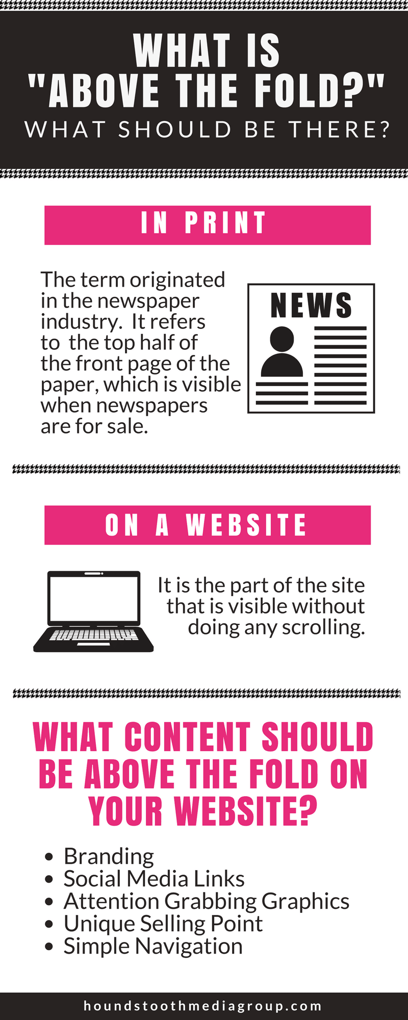
The idea of “above the fold” originated long before the days of the internet. Its roots are in the newspaper industry and refers to the top half of the front page of the paper. This is the area that is visible when newspapers are for sale in boxes or on the shelf. It’s your first impression of the issue; it should grab your attention and make you want to pick the paper up, unfold it, and read more.
In print media, this area is typically reserved for the most important, flashiest headlines of the day. You should take the same approach on your website; the above the fold content should be the most important pieces of information and should entice viewers to dig deeper and learn more. A 2011 study found that most visitors to a website spend 80% of their time looking at the area above the fold; while there is some debate in the web design community about the true importance of above the fold content, these numbers are hard to ignore!
What Area is Considered Above the Fold on a Website?
Typically, this is the part of the site that is visible without doing any scrolling; the most prime real estate on your site because it’s the first thing people see, and even those who don’t explore very deeply into the site will still see it.
With changes over the years to computer screen sizes, and with more and more website traffic coming from mobile devices and tablets, giving exact dimensions for what is above the fold is a little complicated. In responsive web design, where the page layout changes based on the size of the screen it’s being displayed on, it is important to take these differences into consideration to make sure that as much vital information is immediately visible on as many devices as possible.
What Content Should Be Above the Fold?
- Branding. Your logo and other identifying visual information should be first and foremost in a good website design; visitors should immediately have a sense of who you are and what you do.
- Social Media Links. In today’s online environment your social media presence is more important than ever. Make your accounts easy to find by placing your links where the most people will see them.
- Attention-Grabbing Graphics. The internet is a very visual place, so good graphics are a must. Are your graphics making the right first impression? Be sure that the images you choose tell a clear story of what your site is all about. (Also, make sure you have the legal rights to use any photos you put on your website!)
- Unique Selling Point. What makes you different than the competition? Make sure your visitors know right away what makes you special!
- Simple Navigation. Make it as easy as possible for interested viewers to learn more.
Remember that the above the fold portion of your site is just that: a portion. These suggestions are only a few of the things that your overall site design should include. Make sure you aren’t missing any important elements in order to create the best website possible!
