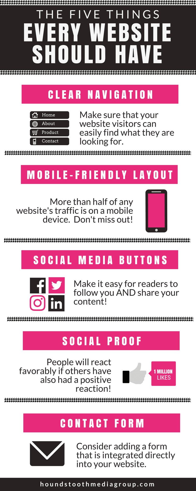
Every website is different; whether it’s a personal site or a site for your business, you want the design and experience to reflect your individual aesthetic and have the things that make you stand out from the crowd. But despite these differences, there are some elements that all sites should have in common. When designing your digital home, keep in mind these five things every website should have.
Clear Navigation
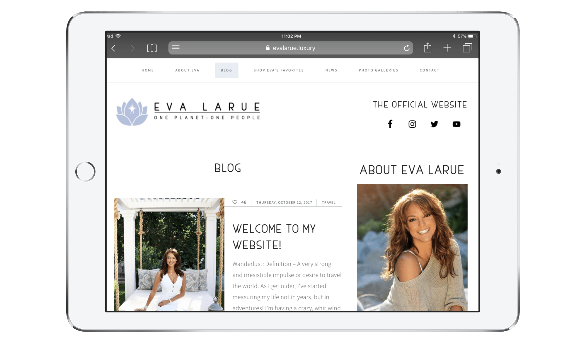
First and foremost, you’ll need to make sure that your website visitors can easily find what they are looking for. The typical web surfer doesn’t have the patience to dig and sift through poorly-organized content. If your navigation is inadequate, overly complicated, or otherwise confusing, many visitors are likely to leave and seek information elsewhere.

To make a good user experience with your website navigation, keep the following in mind:
- Plan ahead. When you are setting up your menu structure, be thoughtful and strategic about the content and placement of your menu and sub-menu items.
- Be descriptive. Your navigation isn’t the place for clever wordplay; clear, concise labeling is best, both for human visitors as well as search engine crawlers!
- Minimize required clicking. All of your most important information should be accessible to visitors with no more than three mouse clicks.
Mobile-Friendly Layout
On average, more than half of any website’s visitors today are using a mobile device. If you aren’t optimizing your site for mobile traffic, you are seriously missing out!
There are two types of mobile-friendly designs.
- Mobile themes. A mobile theme detects what device your visitors are using and displays a different version of your site for mobile users.
- Responsive themes. A responsive theme detects the screen width of the device the site is being viewed on and adjusts the contents accordingly.

While a mobile theme is better than no mobile consideration at all, the industry standard has moved toward responsiveness. A mobile theme may present a pared-down version of your content, and some of your site’s features may not be fully accessible to mobile users. Mobile themes may also make your site look drastically different for mobile visitors than it does for desktop traffic. If you are using a responsive theme, all of your site’s content and features remain accessible, and your design has a consistent look across all devices.
Mobile optimization not only affects user experience, it can also impact your site’s search engine rankings! Google now uses a “mobile first” philosophy when deciding on the order of search engine results, giving favor to sites that are optimized for mobile visitors.
Social Media Buttons
Social media is an important part of modern life. You should always make it easy for your site visitors to do two things: find and follow you on social media, and share your content on their own social accounts. This means that your site should have two sets of social media buttons, with their function clearly defined.
Social media follow buttons should make it easy for visitors to find you on all of the social platforms you use.
- Make them prominent. Put your follow buttons somewhere people are sure to see them! Keep them visible on every page, preferably toward the top of the page. Avoid burying them in your footer or other places that visitors might miss them.
- Clearly define their purpose. Since you should have two sets of social media buttons, make sure each set’s function is obvious. Adding a heading such as “Follow us on social media” or placing the buttons near your other contact info or logo will help people to know the purpose of the buttons.

Social media sharing buttons provide a simple way for visitors to pass along content they find interesting or useful. As with follow buttons, placement is important.
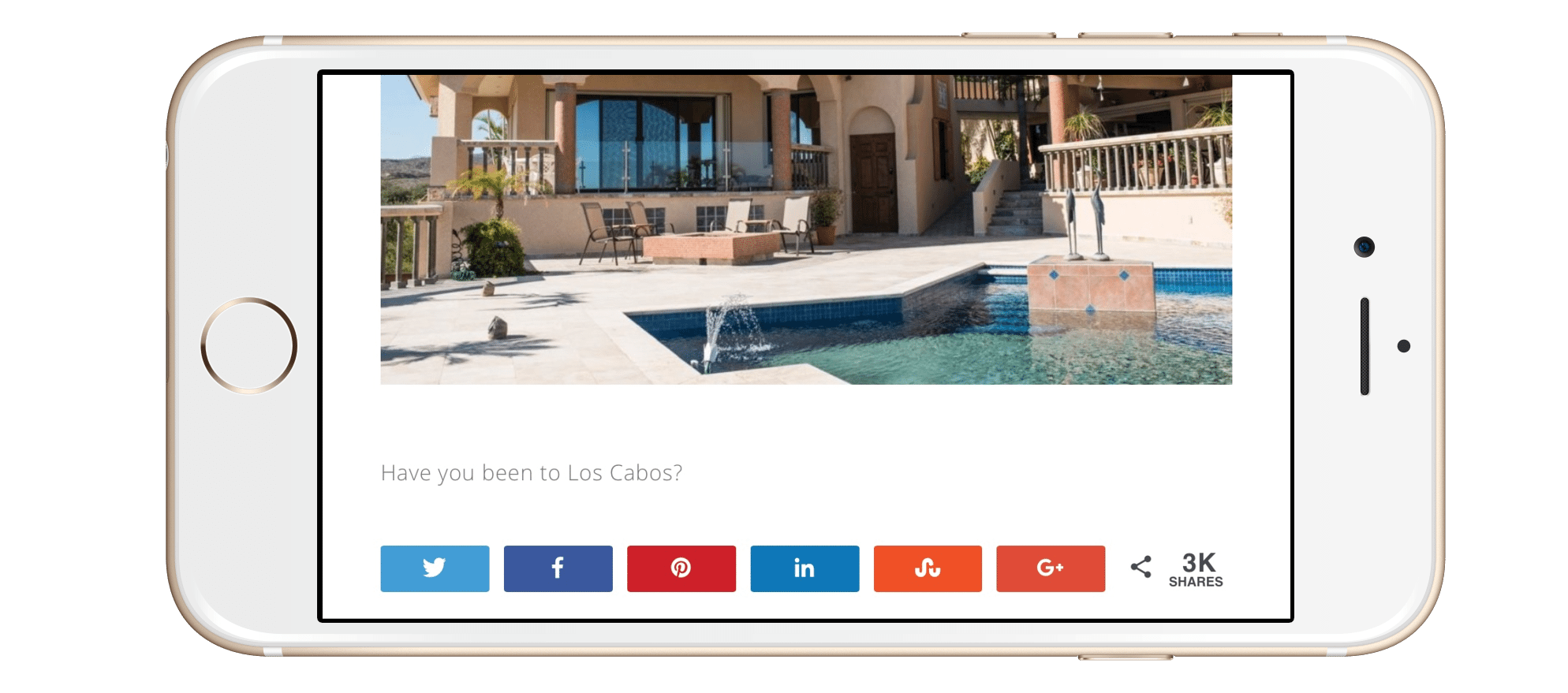
- Make their function clear. Take special consideration to differentiate your sharing buttons from your follow buttons. Placing your share buttons immediately before or after your content, or floating at the side of the content, will help to define their purpose. You can further clarify their purpose by labeling them with something like, “Share this post”.
- Keep design in mind. While you want your buttons to be prominently visible, they should also look cohesive with the rest of your site design. However, if you use custom buttons, be wary of making them look too different from standard buttons or visitors might not recognize what they are for.
Social Proof
You might have heard the term “social proof”, but what does it mean? It’s a complicated psychological phenomenon, but essentially it boils down to the fact that people are more likely to react favorably to your content if they see that others have also had a positive reaction. Harnessing the power of social proof can improve your social media performance, conversions, and lead generation.

- Social share counts. Consider adding share counts to your social media sharing buttons. People are more likely to share content themselves if they see that other people are also sharing!
- Testimonials. You can talk all day about how great your services are, but the views and feelings of others are just as important. Potential clients want to know about the experiences others have had with you.
- Product reviews. If you are selling something, including feedback from previous customers can be a powerful motivator for others to buy as well.
Contact Form
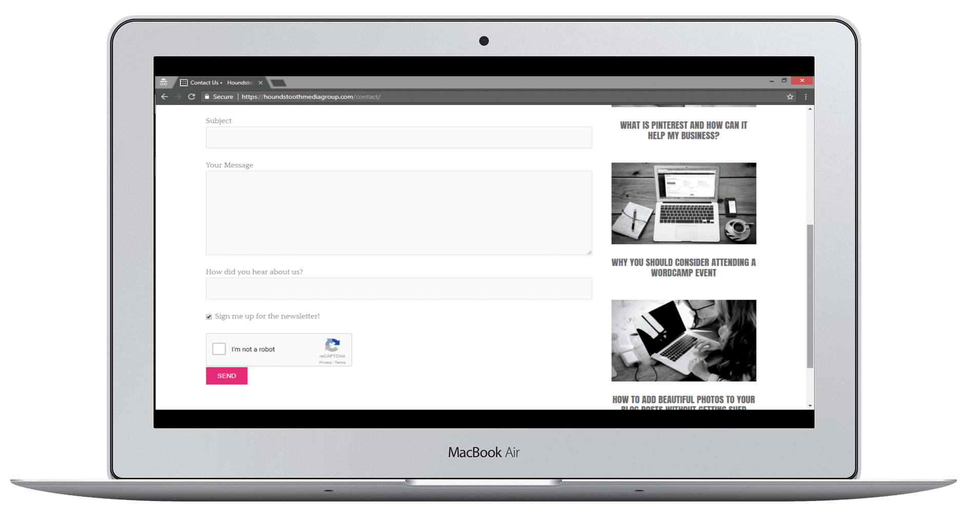
Make it easy for your visitors to reach you if they have questions, concerns, or comments. While adding your email address to your contact information is a step in the right direction, make the process even easier with a form that’s integrated directly into your website.
- Avoid spam. You don’t want your inbox to overflow with spam messages! Weed out spam bots by using a form that includes a captcha or honeypot feature.
- Don’t be a spammer. If you plan to add people who contact you to your email marketing list, be sure to clearly state your intention and give users a way to opt out.

More Things Every Website Should Have
While these five items are among the most important things every website should have, there are also many other factors that a good website should take into consideration.
- Consistent branding. This extends far beyond your site’s logo. Make sure your font and color choices throughout the site match your branding to give a cohesive, polished look.
- Good contrast. Don’t make your site content difficult to read! Pick colors with enough contrast to be easy on the eyes, and avoid things like busy backgrounds that can distract from your text and images.
- SEO strategy. Make it easy for people to find you by following best practices for keyword optimization and SEO architecture.
Keeping all of these things in mind as you design your website will ensure a positive user experience that sets you apart from the competition!
Need help building your site? Check out our website services!
